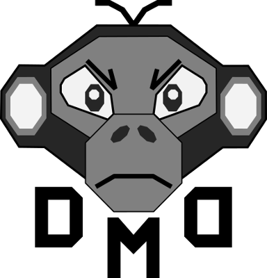
I decided to start a more formal design presence, it was a pretty leap to take my signature design (at least one variation) and build a logo from it. Adding some blocky, almost stencil-like letters to convey the “DMD” concept was also an easy start, even with the second “D” being reversed to add a nice ‘cradle’ for the face.
Reading through Instragram today and scanning the search area, I came across a graphic designer that had some wonderful logo designs. Many of them were beautifully laid out based on clean lines. While I have no allusions of reach that artist’s skill, I was intrigued by his use of lines and combining things.
So, cracking open Inkscape, I decided to experiment on a new logo that was more simplistic logo that could be applied to less ‘tactical’ designs and projects. My plan was to combined the “D” and “M” of Data Monkey. With that simple plan, I cranked out the designs below. There is a subtle difference – the upward line for the “M” borrows the curve from the “D” on the righthand design, versus the straight of the left.
Not in a hurry to change my logo, but thought this was a nice experiment, and something to potentially use in the future.

